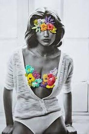
portrait transformation
JOSE ROMUSSI
|
Jose Romussi was born in 1979 in Chile. Romusi was an artist who uses hand embroidery to embellish photographs. He studied landscape design but later on in life he came known for his prints and collages. He lives in Germany,Berlin and works there. He has been working on a number of projects for the last decade for instance he has included decorative needlework techniques notably applique and embroidery to further embellish photographs.
|
|
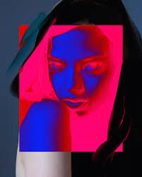
RAFAEL SLIKS
|
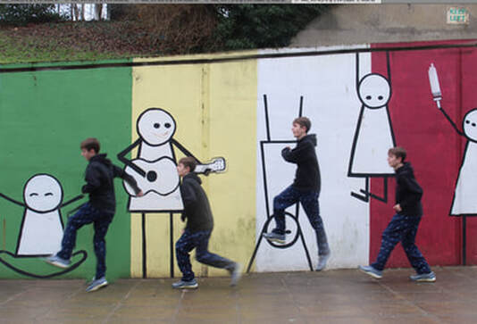
Rafael Sliks is a talented Brazilian graffiti painter. Sliks career first kicked off around 1997. His work is mostly graffiti. However he has also has work has been exhibited his in art galleries such as places like Australia,Europe,and United States. When Sliks works indoors he uses colour repetition and many more things. Rafael Sliks makes portraits and graffitis over them. Sliks graffiti his name on the photo in black. This makes the portrait stand out a lot more. This also covers the face of the model. The reason why I like this photo is because it stands out compare to most photos.
What is the subject |

|
David Marinos
|
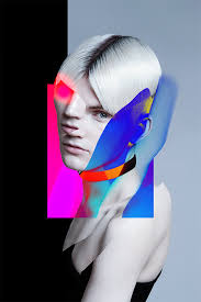
David Marinos was born in 1998 he is half Greek half Ukranian. Marinos has traveled to many different countries such as Spain, Russia, America and many more countries. He studied 3 years in the USA. Marinos uses classical imagery but alters them in a non-traditional way, such as he adds different colours to them and partially makes them negative.
Can you explain how he alters them? How have the images changed from their originals? |
|
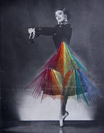
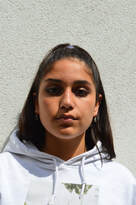
RANKIN 'DESTROY'
JOHN RANKIN
|
John Rankin Waddell is a famous photographer who was born in 1966 in England and he still lives here to this day. Rankin is a famous photographer who is well known for taking normal portraits and then starts to manipulating them. Rankin has worked with very many different famous people like The Rolling Stones, David Bowie, Kate Moss, Kendall Jenner and The Queen and many more. He is now 53 years old and still working to this day.
Rankin took the celebrities' photos and they were asked themselves to destroy/transform them by doing this to them such as burning, them writing on top off them and many more things. Explain what the Rankin-inspired 'Destroy' portraits are and how the celebrities have manipulated their images. Include his work. |
|
|
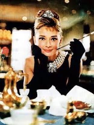
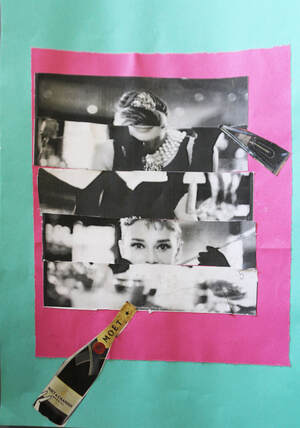
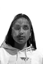
Today I used the image breakfast at tiffany's. I Destroyed the original image and put it black and white and added multiple colours and shopping relate to audrey hepburn when she plays the roll of Holly Golightly. I thought that the colours and images of the champagne and handbags went well with her as a person in whole because she is a classy person and that comes from money.
Next time I would add more images to make the photo look more full and also be a lot more creative on the way I cut up the image of Audrey Hepburn for example could do it in little squares and different shapes instead of just cutting them up in lines and placing them if the wrong order. |
|
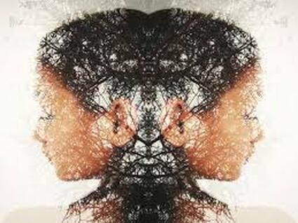
CHRISTOFER RELANDER
|
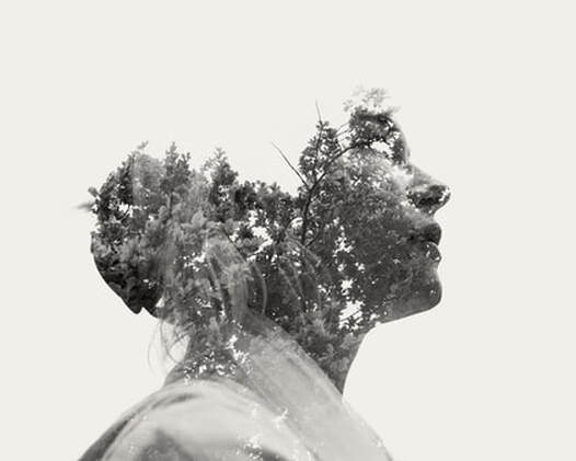
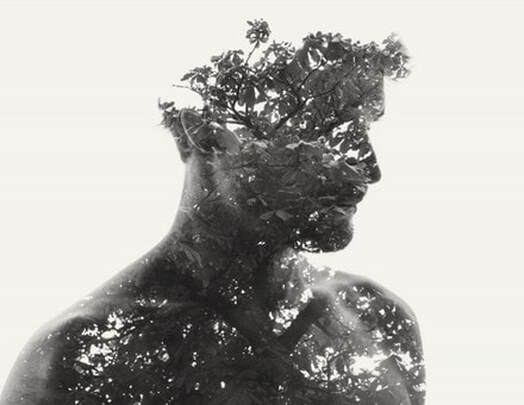
Christoffer Relander was born in Finland in December in 1986. Relander is working as a full time photographer His work has been published in notable publications and websites globally such as The Guardian's Observer, LA Times, Oprah.com, Huffington Post, China Daily and VICE. He was never that interested in art when he was younger until he found his passion for photography in 2009. He took a photo off both person and the nature and edited them together to make an effect where you can see the nature clearly and the persons outline . I like this work because its unique and you don't usually see photos like this.
. Include an explanation of the kind of work he makes/this is. |
|
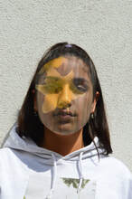
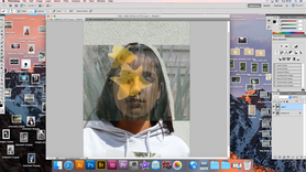
DOUBLE EXPOSURE
|
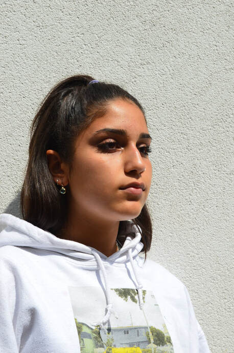
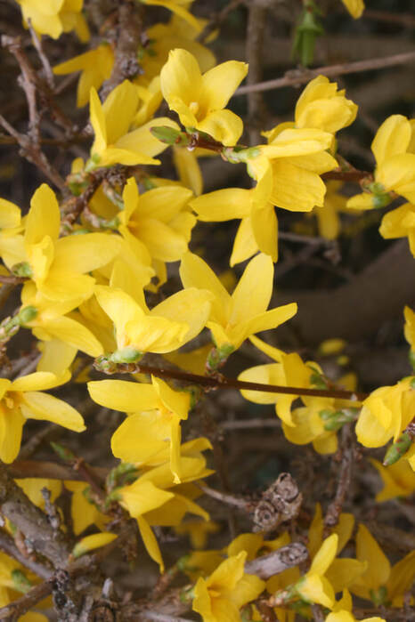
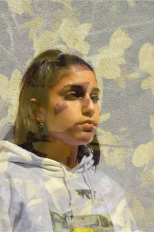
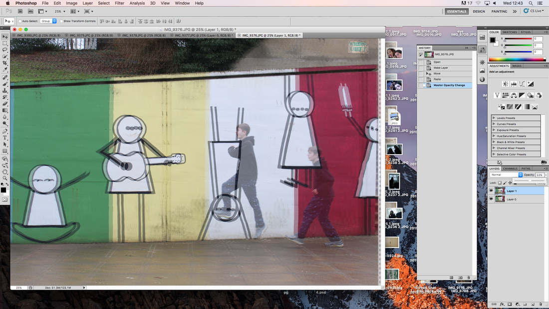
For this project I used multiple different images. The next step I went on photoshop and opened my file and opened both of the images up and the image I took of the flowers I opened it up and The picture I took of Mia I put it on lock as you can see on the screen shot below.
WWW:What I liked about this particular project is that when you look at the image when they rejoined together it creates a double exposure effect. I also liked how there are two brightener tones on this picture.
EBI:Next time I need to put the picture in more focus. |
|
|
|
|

|
|
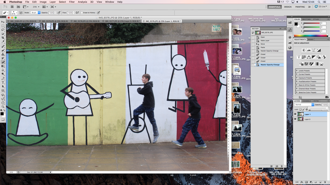
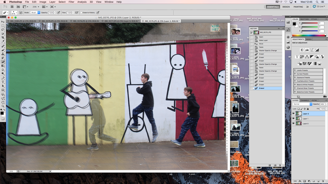
In these photos I used a different image for the combined nature photo. This is an improvement because I erased the photo from the rest off the photo to focus on her face more than the whole picture.
Then I went back to photoshop and then made it black and white after that i changed the brightness contrast and then got rid of the background so its just white. I like the black and white one because I like the contrast of it. |
|
|
best outcome
|
|
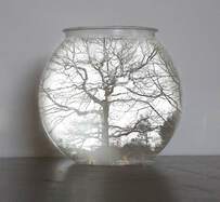
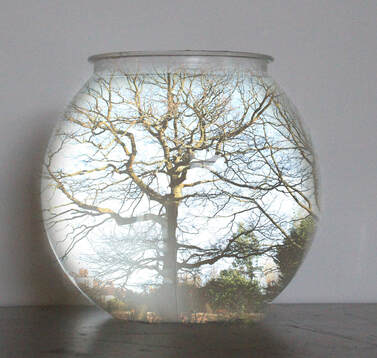
First I took pictures of trees, then I got an idea from Christopher Relander with double exposure and how he put nature into something more compact like a vase or someones face. I personally like it because the idea of wood and nature mixed together as one.
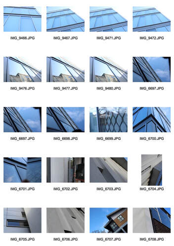
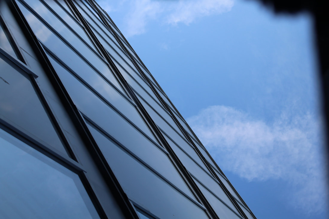
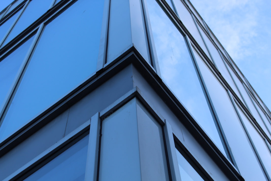
force of architecture
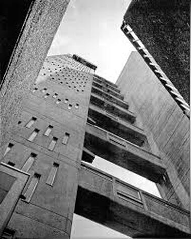
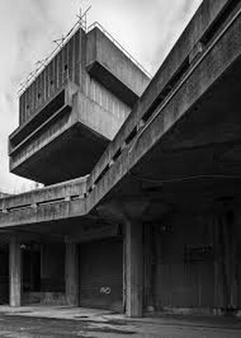
SIMON PHIPPS
|
Simon Phipps said about his work:
The departure point for my photographic documentation of brutalist architecture is Reyner Banham's essay ‘The New Brutalism’ published in the Architectural Review, December 1955. Brutalism’s properties were characterized by Banham as being: ‘1, Formal legibility of plan; 2, clear exhibition of structure, and 3, valuation of materials for their inherent qualities “as found”.’ I have photographed a number of buildings that sit within a loose Brutalist principle and rather than present them as photographic prints have produced them as monochrome images printed directly onto an aluminium substrate. I felt this would capture the idea of ‘valuation of materials “as found”, whist aluminium also resonates with concrete as a material in it’s visual neutralness. Concrete as a material would seem to have the neutral qualities to illustrate this observation and it is this very lack of colour in the brutalist prints that allow us to judge the forms as architecture. The decision to print directly on to aluminum is fascinating and could not be more perfect. The style of architecture was all about materials and the aluminum certainly evokes feelings of those used to construct the buildings. |
|
|
|
|
force of nature
|
|
|
|
|
3 Strands
Strand 1: Force of Nature
NADAV KANDER
|
Nadav Kander is a photographer based in London but he is born in Israel in 1961. Kander is known for photographing landscape and portraits. He used to use a Pentax camera and stared taking photos when he was around 13 and decide to move to stick with photography and in 2009 his work got published by the New York times and this was fifty two colour portraits. Because Kander took such amazing images he stared taking photos for such high end brand like Giorgio armini Alexanda Mcqueen and many more.
|
|
|
|
|
Strand 2: explosion
DAN TOBEN SMITH

|
Dan Toben Smith is an English photographer who photographers many different things but the one I am looking at the most is called The Power Of Powder. Dan Toben Smith does this by an empty light room and then powder got released in the room to make an almost like explosion effect in his work. Dan Toben Smith used a range of different colours whilst doing this.
|

|
MY ATTEMPT
|
|
|
|
|
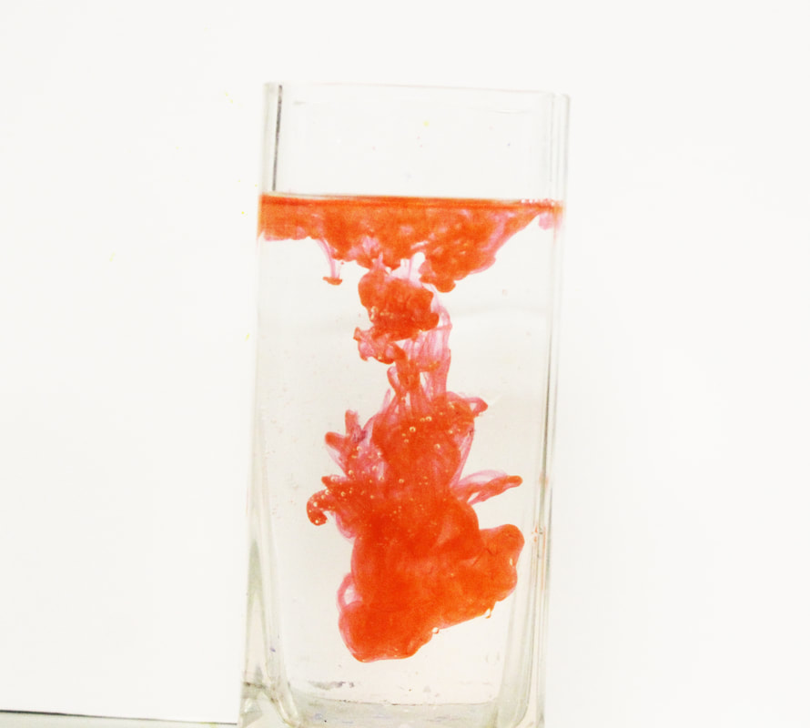
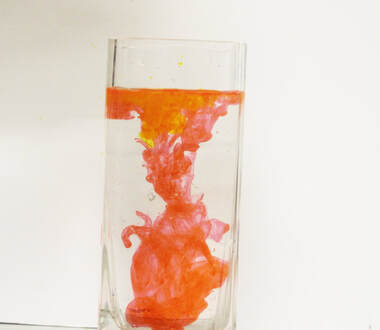
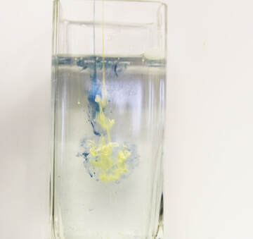
Today I tried creating the same effect affect of Dan Toben Smith "power by powder" however instead of putting powder into water I used ink and it gave a similar effect to the powder. The reason I picked this topic as one of my strands is because it comes out with a really satisfying image and uses a different way to explore ink and water mixed together.
Strand 3: Burst balloons
TIM TADDER
|
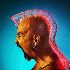
Tim Tadder is a photographer who captures many different things but I am looking at the rate ballon effect. Tadder is ranked in the top 200 worldwide. Tadder mostly used bald men or women in these images so it almost looked like a wig on there head. This was a series of images called water wigs. The way sadder captured these images was that he combined high speed flash and the bald people.
|
|
FAVOURITE STRAND
|
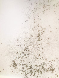
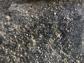
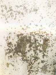
My favourite strand:
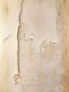
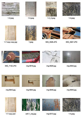
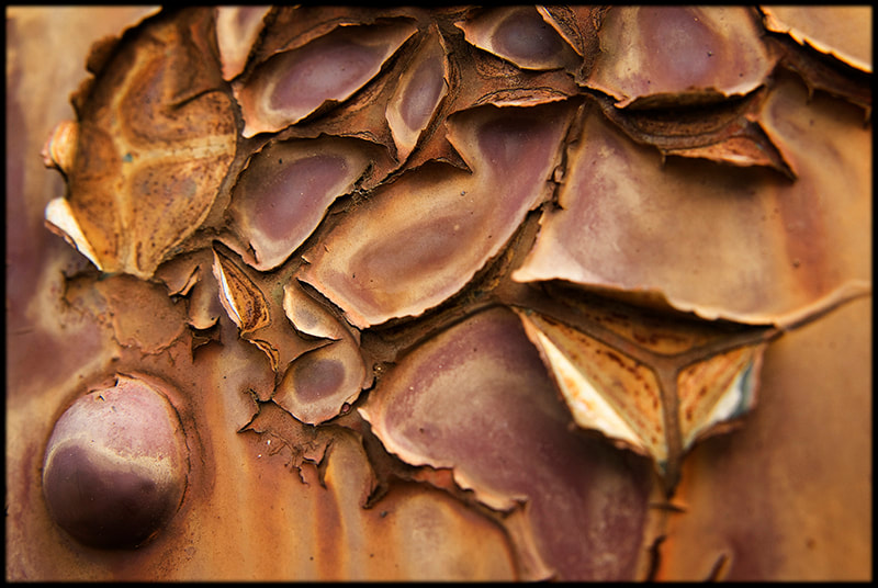
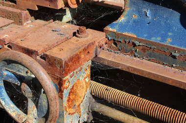
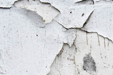
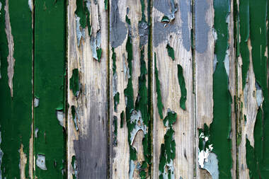
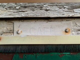
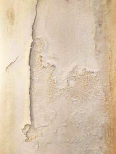
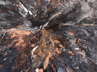
For my favourite strand I chose to explore close up textures. I looked for examples of dried, peeling paint and rust similarly to Colin Winterbottom. The reason I really like this strand is because of how |
|
The best images are of the peeling green paint. Some of the other images are not as well exposed or have the reflection of the flash. I need to find more textures outside to avoid this. The green painted door also worked well because I was able to have a slightly wider shot. Another thing I could do is find larger areas of decay.
Best edit
|
|
|
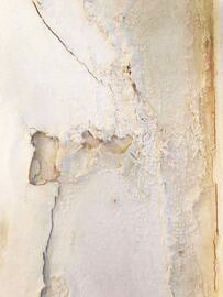
second development
|
|
|
What I did to develop these images from the first development was I tried taking these images from further away than usual. Below these are my favourite image from this development. I like this effect of decay because its different way to explore photography.
third development

|
|
|
|
|

|
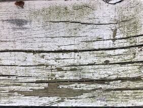
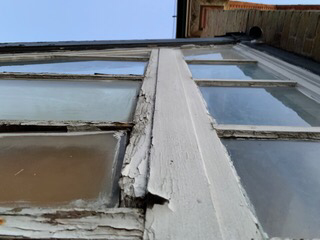
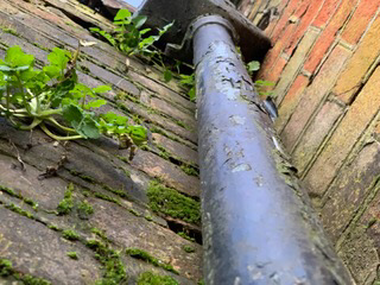
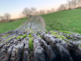
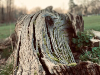
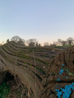
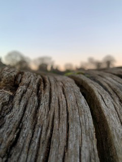
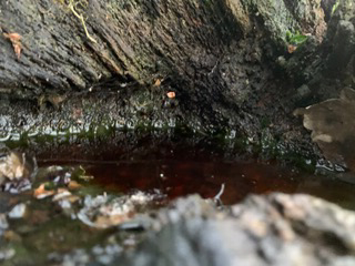
For my third development I have decided to look at wood instead off walls. I think this would provide another a
FINAL PIECE
|

|
|